LUBUNTU IDENTITY MANUAL
ABOUT THIS MANUAL
This Lubuntu Corporate Identity Manual contains the rules and guidelines as they relate to the correct visual portrayal of Lubuntu as a Brand. There are guidelines for the official colours, fonts (typefaces), as well as other visual iconography, and how they may be merged into acceptable documents or communications. Please do not use this manual to replicate artwork. Original digital artwork will be available on the website. We are not in a position to supply artwork in other format unless it is specifically required for paid for productions, or advertising. The logo may not be used if it does not conform to these guidelines.
If you have any queries please contact the Lubuntu teams:
Please note that these pages were printed on a laser printer and colours are not 100% accurate. Also non-calibrated monitors will not be able to represent true colours unless ICC / ICM profiles are set up.
CONTENT
- The Logo
- Exclusion zone
- Symbol
- Logo Colour Ways
- Symbol Colourways
- Colours
- Minimum Size
- Incorrect Uses
- Colour Combinations
- Companion Logos
- Teams Icons
- Web Symbols
- Typography
- Thank you!
THE LOGO
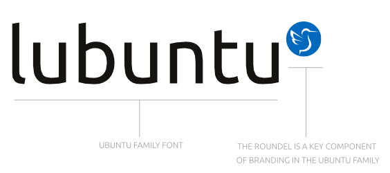
For the sake of legibility, the logo must never use uppercase letters at all. The font used must always be the Ubuntu Font Family. The roundel is a key component of branding in the Ubuntu Family.
EXCLUSION ZONE
Defining the exclusion zone.
The logo must always have a clear surrounding it, free from any other element.

SYMBOL
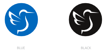
The symbol is the new LXQt desktop hummingbird mascot. It’s position is calculated to appear visually centered and balanced. The bird must be white, not transparent, nor of any other colour.
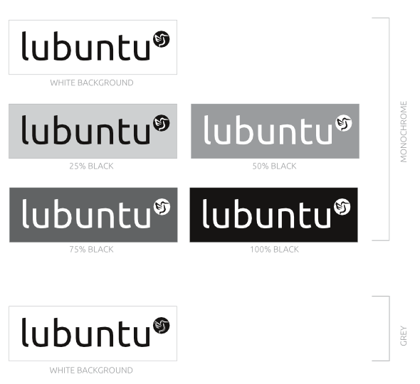
Colour of the roundel can only be Blue #68c8ff or Grey.

LOGO COLOURWAYS
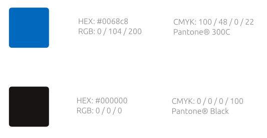
The wordmark is supplied as Pantone® and CMYK version for print, and RGB / HEX versions for web. It can only be used on one of the given colours.
Never change any of the colours in the logo.

SYMBOL COLOURWAYS
The symbol is supplied as Pantone® and CMYK versions for print, and RGB / HEX versions for web. It can only be used on one of the given colours.
Never change any of the colours in the logo.
COLOURS
MINIMUM SIZE
The standard version of the logo must never be used at a width less than 5cm.
INCORRECT USES
You must not…
- Change the spacing between the individual elements of characters
- Change the colour of the wordmark
- Change the colour of the roundel or its contents
- Change the arrangement of the elements
- Place the logo at an angle other than horizontal or vertical
- Change the proportions of the logo
- Place the logo on a non brand colour
Below you’ll find examples of how the logo should not be used:
COLOUR COMBINATIONS
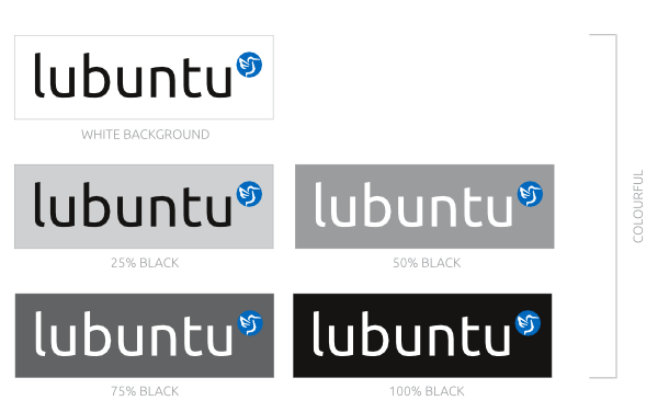
Depending on the background the logo might be shown in different ways. When the background intensity is over 50% intensity the logo will turn white.
COMPANION LOGOS
The sub-brands or applied logos must follow the above rules.
TEAMS ICONS
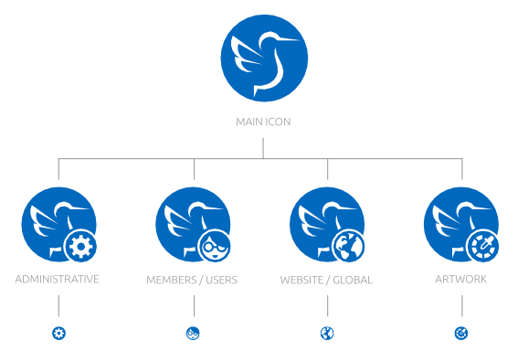
The GitHub / Launchpad teams will be identified by “family icons”, meaning that the main image will remain the Lubuntu icon, identifying each family (team) with a monochromatic overlay glyph. For the very small icons on Launchpad (14px) only the overlay will be used.
WEB SYMBOLS
Symbols used for links or illustrations in websites must followthis scheme: they shall use the corporate blue contour with white filling, never transparent.
TYPOGRAPHY
The typography used for all interfaces and media must be the Ubuntu Font, designed by Dalton Maag, in different weights if needed.
THANK YOU!
♥
The Lubuntu corporate image and the manual were possible thanks to the Lubuntu Team work and community support.

This work is licensed under a Creative Commons Attribution-NonCommercial-NoDerivatives 4.0 International License.
